FinServ — Payments Dashboard
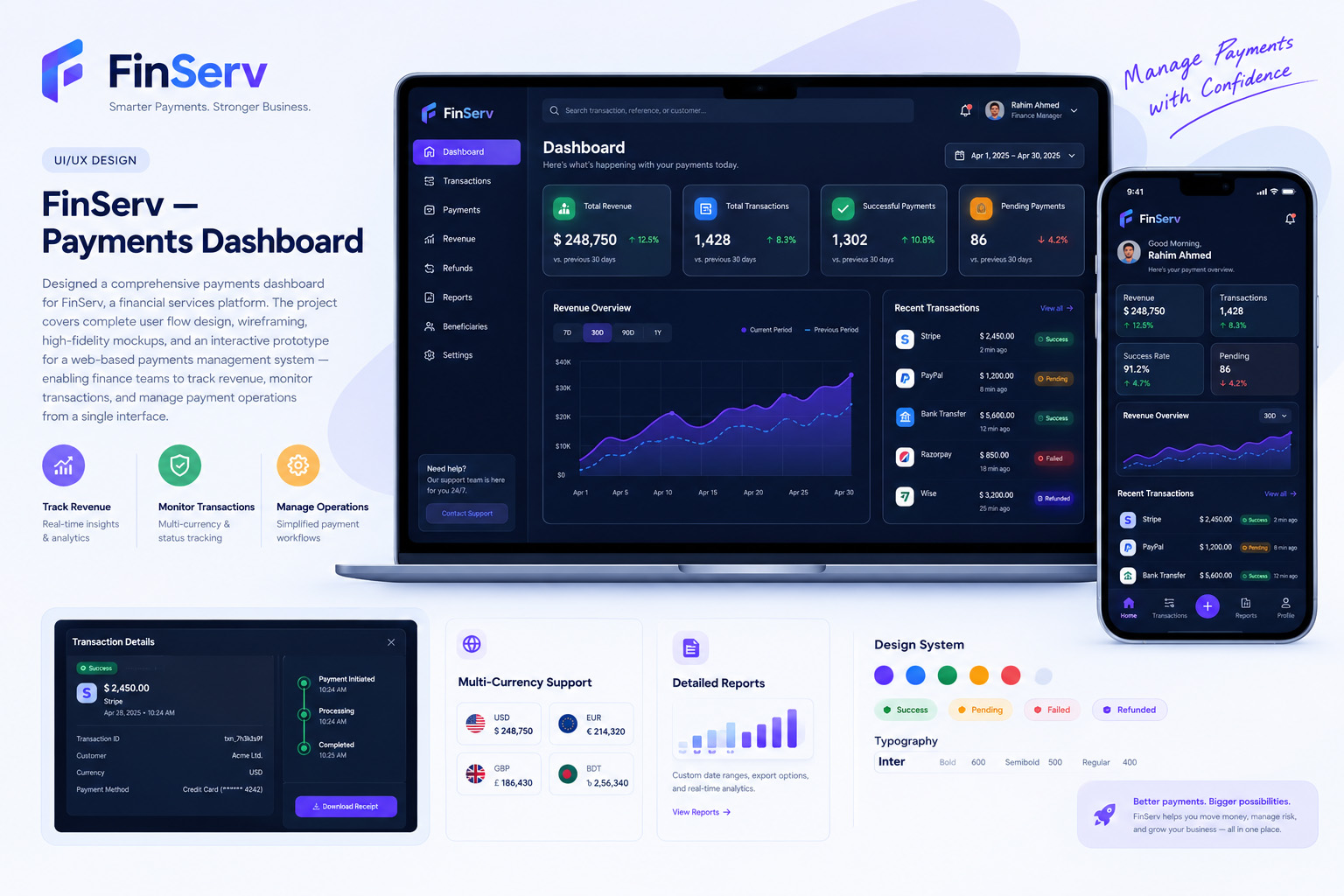
Designed a comprehensive payments dashboard UI/UX for FinServ, a financial services platform. The project covers complete user flow design, wireframing, high-fidelity mockups, and an interactive prototype for a web-based payments management system — enabling finance teams to track revenue, monitor transactions, and manage payment operations from a single interface.
The Challenge
FinServ needed a dashboard that could present complex financial data — multi-currency transactions, real-time payment flows, revenue analytics — in a way that is visually clear and immediately actionable. The existing interface was cluttered and data-heavy, causing slow decision-making and frequent navigation errors among finance teams.
Our Solution
We designed a clean, dark-themed dashboard with a structured information hierarchy. Critical KPIs are surfaced in prominent stat cards with trend indicators. An interactive area chart allows date-range comparison of revenue periods. A real-time transaction feed with inline status badges (Success, Pending, Failed, Refunded) reduces time-to-insight. The sidebar navigation logically groups features, and a consistent design system ensures the interface scales across all screen sizes.
Project Details
- Client
- FinServ
- Service
- UI/UX Design
- Date
- Oct 2025
Have a similar project?
Start Your ProjectClient Feedback
"They redesigned our dashboard UX and the difference is night and day. Users find what they need instantly. Real research, real prototypes, real results."
Sumaiya Islam
Co-founder, LearnLoop